Pitch Count / Point Effects in Baseball and Tennis
Although I do statistical work in baseball, I have been playing tennis for 50+ years, and I believe there are great opportunities for interesting work in tennis. (Compared with baseball, there is remarkably little statistics research in tennis.) Recently I became aware of point-by-point data available for all singles matches in the last 15 Grand Slams on Jeff Sackman’s GitHub site. This is great data which should motivate me to write my first tennis paper.
It occurred to me that an individual game of tennis has much in common with a plate appearance in baseball. Let me explain the connection, focusing on the effects due to the point score (tennis) and the pitch count (baseball), and then conclude by using R to demonstrate the pitch count effects for balls put in play.
- [TENNIS] A single “game” of tennis consists of a series of points between a server and a receiver, and the server has the advantage — he/she has approximately a 60% chance of winning a point (and a 74% chance of winning the game).
- [BASEBALL] A plate appearance is a series of pitches between a pitcher and a batter, and the pitcher has the upper hand — 68% of the PA’s are “won” by the pitcher since 68% of the run values are negative.
- [TENNIS] A game wins if one player has won four points, provided that the winner has at least a 2-point lead. It is possible (with one or more deuce points) that the game last for many points.
- [BASEBALL] A PA ends with one or more pitches. Like a game of tennis, a PA may last many pitches with repeated foul balls.
- [TENNIS] There is momentum in tennis. Using data from one of the Slams, I find that the probability the server wins the first point (at 0-0) is about 61%. If the server wins two points (new score 30-0), the probability he/she wins the next point increases to 64%; if he wins the first three points (score 40-0), the probability the server wins the point is 67%.
- [BASEBALL] Similarly, in baseball there are pitcher counts and hitter counts, and the outcome of a pitch put in-play depends on the count.
In Chapter 7 of Analyzing Baseball Data with R, Max discusses the outcomes of PA’s that pass through particular counts. This work was not trivial since it required the use of regular expressions on the pitch sequence variable in the Retrosheet play-by-play dataset. Here I’ll summarize the R work to obtain the pitch-count effects of balls put into play.
- First I download the Retrosheet play-by-play for the 2014 season. See this post for details.
- For all plays, compute the run values — I have a function
compute.runs.expectancywhich does this. - I focus on only the batting plays and create a pitch count variable and a variable
N.Balls.Strikesthat records the sum of balls and strikes in the pitch count.
pbp.bat <- subset(pbp, BAT_EVENT_FL==TRUE)
pbp.bat$The.Count <- with(pbp.bat,
                          paste(BALLS_CT, "-", STRIKES_CT, sep=""))
library(dplyr)
pbp.bat <- mutate(pbp.bat, N.Balls.Strikes = BALLS_CT + STRIKES_CT)
summarize function in the dpylr package, for only the pitches put in play (remove strikeouts and walks), I compute the mean runs value and the proportion of positive run values for each pitch count.
S.inplay <- summarize(group_by(filter(pbp.bat,
                       !(EVENT_CD %in% c(3, 14, 15))),
                         The.Count),
                     N.Balls.Strikes = N.Balls.Strikes[1],
                     N=length(RUNS.VALUE),
                     Mean=mean(RUNS.VALUE),
                     P.Positive=mean(RUNS.VALUE > 0))
Using the ggplot2 package, here are plots of the count effects. First, I graph the mean run value of balls placed in play at each count, and next I graph the probability of a positive run value for balls in play for each count. In each case, I have added horizontal lines that give the mean run value and probability of a positive run value for all balls put in play.


A couple of remarks about these graphs, connecting this with tennis.
- These graphs make it obvious what we mean by pitcher and batter counts. Batters want to work the count (to batter counts) to get a better opportunity to get a good pitch to hit.
- I’d be interested in learning more about how different pitchers and hitters use the pitch count. For example, I’d be interested in learning about the specific pitchers who take best advantage of pitcher counts.
- Returning back to tennis, similar graphs can be constructed showing how the probability a server wins a point depends on the game score. Here is one sample graph gathered from Slam data — it shows the probability the server wins a point at different scores during game. (This pattern makes sense since serves play a big role in singles and players go through hot streaks of serving well.)
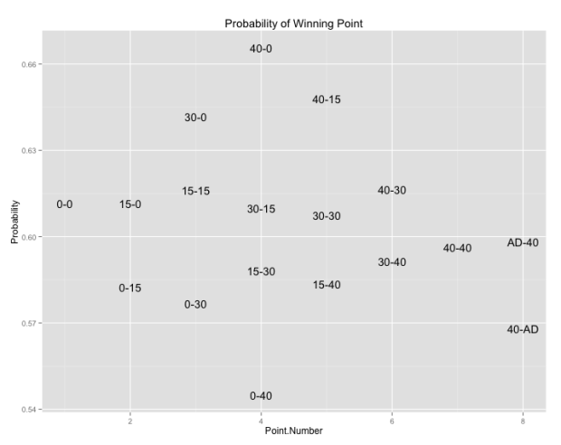
Particular players (I’m thinking of Roger Federer) appear to have large “serving momentums”. One question I plan on exploring in the future is comparing serving momentum between the top singles players.


Recent Comments