ATP Stat Leaderboards
Sorry for this digression into tennis, but the ATP has recently unveiled their Stat Leaderboards which are remarkable, but not in a positive way.
Some years ago, one of baseball’s holy grails was to determine the best measure of batting performance. A large number of measures were proposed — BA, SLG, OBP, OPS, linear weights, TA, etc. Suppose we want to get a summary measure of batting — why don’t we add up these 20 or so proposed batting measures?
Of course this is a crazy idea — most of these measures are strongly correlated, they are on different scales, and some of these measures are not that strongly related to runs scored.
Let’s move to the world of tennis analytics — here is a snapshot of the Leaderboard for serving:
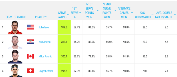
John Isner is the top of the leaderboard with a Serve Rating of 319.8 — how is this calculated? On the page it says …
The Serve Rating© adds four service metrics percentages plus the average number of aces per match and subtracts the average number of double faults per match.
Really? On what basis does it make sense to sum these six measures?
Making Some Sense of this Data
One can represent this data by this tree diagram.
- The first level represents the result of the serve (1st serve, 2nd serve, or double fault).
- The second level represents the result of the point (server wins or loses) conditional on the result of the serve.
- The first three stats on the leaderboard are the 1st serve percentage (69.4), the percentage of points won when the 1st serve is in (81), and the percentage of points won when the 2nd serve is in (55.7).

Based on this tree diagram, the probability the server wins the point is
P(win) = 0.694 (0.81) + (0.291) (.557) = 0.724
Now if you know the probability the server wins a point, one can make an educated guess at the probability a server wins the game. (I won’t go into the details, but if you assume the probability of winning a point is p and independence between points, then some algebra and conditional probability will show that the probability of winning the game is a function of p.)
But the fourth stat on the leaderboard is the percentage of service games won — by above we see that this percentage is approximately a function of the first three statistics so this fourth stat is redundant. (I say approximately since I don’t know the fraction of double faults.)
Measuring Server Effectiveness
Of course, this serving measure also adds the rate of aces and subtracts the rate of double faults which makes little sense. Typically one wants to add things that are on the same scale, and I doubt a first-serve percentage and the number of aces per match are on similar scales.
Leaving this silliness aside, let’s focus on the important question — what are we trying to measure? If we are measuring server effectiveness, maybe only one statistic is relevant — the percentage of service games won. Sure, it is fun to watch aces, but really all that matters is winning the game. Also this single percentage is more descriptive — I understand what it means for John Isner to win 93.8% of his serves. I don’t know what a rating of 319.8 means.
Some Data Exploration
This server rating leaderboard did motivate me to explore a question. From the first three percentages, I can estimate the percentage of points won by each server. (I assume a constant double fault percentage in this approximation.) Based on this percentage and assuming independence between points, I can estimate the percentage of server games won. How does this estimate compare with the actual game win percentage posted on this leaderboard?
Here’s a graph that plots the estimate percentage of games won (horizontal) against the actual percentage of games won (vertical). I’ve added the line y = x for comparison.

Points that fall above the line (such as Malek Jaziri) tend to win a higher fraction of server games than one would predict on the basis of the proportion of server points won. In contrast, points falling below the line (such as Borna Coric) tend to win fewer server games than predicted on the basis of fraction of points won.
What does this mean?
I offer several suggestions.
- Double faulting. I assumed in my estimation that players double-faulted at the same rate. If I adjusted for different double-fault rates, that might explain the deviations between predicted and observed service games won.
- Momentum? I am assuming that the probability of a server winning each point is constant and that results of different points are independent. This is obviously not true — in fact, I showed in an earlier post that the probability of server winning a point depends on the game score. It would be interesting to explore the differences in the momentum effect between servers.
Summing Up
Anyway, I hope the ATP comes up with a simpler, more useful measure of server effectiveness. But I don’t think it will happen soon — we are still stuck with the NFL quarterback rating scale, although ESPN introduced a more useful measure.

Recent Comments