In past posts, I have talked about various issues with pitch counts. I’ve posted about the First Pitch Effect, the Chance of a Hit During Different Pitch Counts, Pitch Count Effects in Baseball (comparing with tennis), and Probabilities in the Sequence of Pitch Counts.
Here I’m interested in revisiting a particular exploration from Chapter 7 of Analyzing Baseball with R. Using Retrosheet play-by-play data from the 2011 season, Max computed the mean run value for all plate appearances through each possible balls/strikes count. Here’s a heat-map graph of these mean run values from the book. (Heat maps are popular for understanding how a batting average of a player changes by the pitch location, or understanding the locations of a pitcher’s fastballs.)
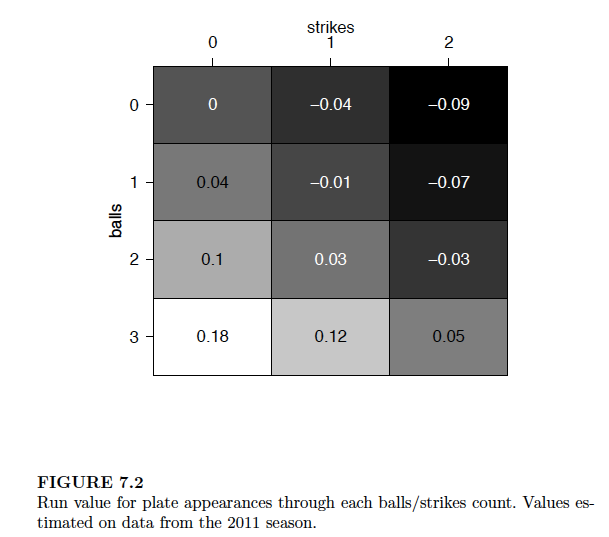
Although this graph is effective in classifying the pitch counts into those favoring the pitcher (dark) and those favoring the batter (light), I don’t think this graph is helpful in seeing how the run values change as one progresses through a count from 0-0 to 3-2. So I am proposing a different display that I think is better for seeing the change in run values.
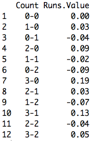
I used data from the 2015 season to compute (as Max did) the mean runs values for all PA’s going through all possible counts. Here’s a table of the values I computed which compare closely to Max’s values for the 2011 season.
In the following ggplot2 graph, I graph these mean run values as a function of the pitch number. I connect the points by lines to show the change in mean run value as one strike or one ball is added to the count. Positive values are favorable to the hitter, negative values are favorable to the pitcher, and I use different colors to divide pitcher and hitter counts.
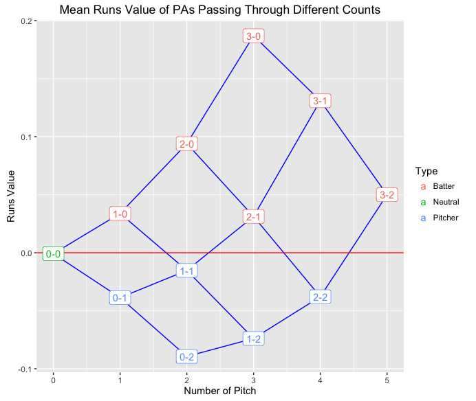
Looking at this graph …
- It is clear how one additional ball or one additional strike affects the mean runs value. For example, starting at a 0-0 count with a runs value of zero, the mean runs will increase or decrease by approximately 0.04 depending on the result of the first pitch.
- It is easy to see from the graph that 1-0 and 2-1 are similar from a runs perspective; likewise 0-1 and 2-2 counts are similar.
- The most extreme counts are PA’s that pass through 0-2 (favoring the pitcher) and 3-0, 3-1, and 2-0 (favoring the batter).
- The effect of one additional ball becomes more significant as the pitch count progresses. The change from a 1-0 count to a 2-0 is 0.06, while the change from a 2-0 count to a 3-0 count is 0.10.
- One can define the leverage or importance of a specific count as the absolute difference of the runs value with an additional strike and the runs value with an additional ball. The 0-0 count has a small leverage value of 0.07. In contrast, the 2-0 count has a large leverage of 0.16. Generally, later pitch counts have larger leverages. From a fan’s perspective, he or she is most interested in seeing the result of pitches with high leverages. Similarly, one would think that strong pitchers would perform well at counts with high leverage.
Of course, this graph represents the average run values for all pitch counts. It would be interesting to explore further, seeing, for example, how these pitch count effects vary as a function of the quality of the pitcher and the quality of the hitter.
