Introduction
In last week’s post we explored the 2017 home run hitting using the newly released Retrosheet play-by-play data. We looked at weather effects (home runs appear to be less common in the colder months), spacings between successive home runs, runs-values (most home runs are of the solo variety), and compared the quantiles of the 2017 and 2016 home run rates. Since a record number of home runs were hit in the 2017 season, this topic deserves a second post. Using Statcast data, we look at the locations in the zone where home runs are hit, and also look at the popular counts for home run hitting.
Where in the Zone are Home Runs Hit?
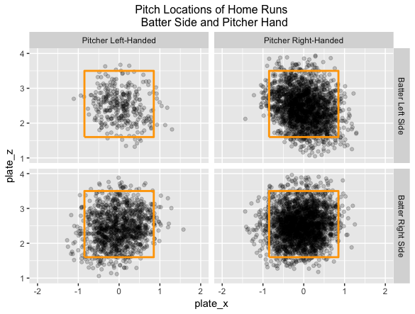
In the 2017 season, 6209 of the 129,365 balls in play were home runs for a rate of 6209 / 129,365 = 0.048. For a first look at popular zone locations, I divide the data into four groups by the hitter side and the pitcher arm and construct scatterplots of the zone locations of the home runs. I make the darkness of the plotted points somewhat transparent (using the alpha option in the ggplot2 package) that seemed helpful in showing the popular home run areas in the zone. Not surprisingly, most home runs are hit on pitches within the zone
Modeling the Home Run Probability
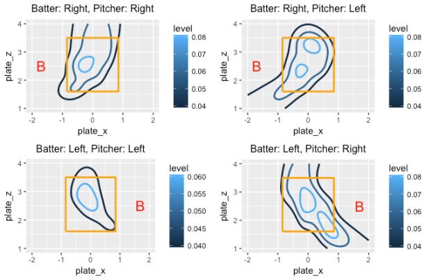
Since the above scatterplots are not that informative, we fit a regression model to get a smooth description of the pattern of home run hitting. Let p denote the probability a batted ball is a home run. Using the gam function from the mgcv package in R, one can fit the generalized additive model of the form
log (p / (1 – p)) = s(plate_x, plate_z)
where s() is a smooth function of the horizontal and vertical pitch locations. We fit this model four times for each of the four groups (depending on the batter side and pitcher arm). By constructing contour plots of the fitted probabilities, we get a sense of the popular home runs for each scenario. In the graph, the contour lines correspond to home run probabilities of 0.04, 0.06, and 0.08. I add the “B” symbol to clarify the batter side in each case.
These graphs are interesting to read. For situations where the batter and pitcher are on the same side (graphs on the left side), the hot zone is in the middle of the zone and low-inside pitches. When the batter and pitcher are on opposite sides (graphs on the right side), there are multiple regions where the home run probability exceeds 0.08, and the size of the region where the probability is larger than 0.04 is much larger than the “same side” case.
Home Run Count Effects
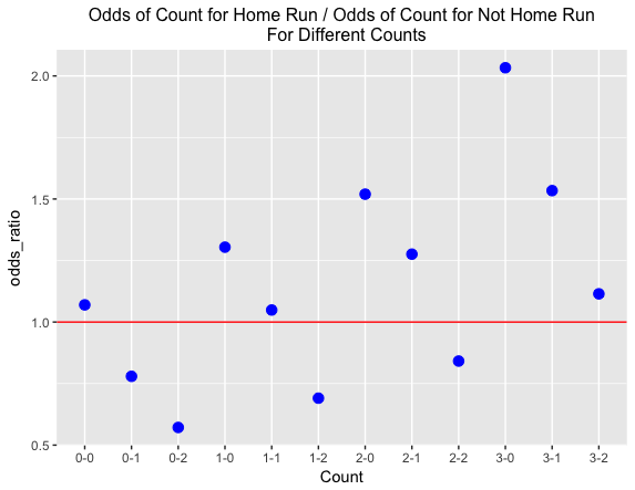
One way to clearly understand the importance of the count is to look at home run hitting. We record the in-play count (balls and strikes) and whether or not a home run was hit for each batted ball during the 2017 season.
Among all batted balls that were home runs, 16.2 % occurred on a 0-0 count, and for all batted balls that were not home runs, 15.4 % occurred on a 0-0 count. Convert these probabilities to odds — the odds of a 0-0 count for a home run is 16.2 / (100 – 16.2) = 0.193 and the odds of a 0-0 count for a not home run is 15.4 / (100 – 15.4) = 0.182. The ratio of the odds — (odds of 0-0 count for home run) / (odds of 0-0 count for not home run) = 1.06. So a 0-0 count is slightly more likely for a home run than for not a home run.
We repeat this calculation for all possible counts on a batted ball — here’s the graph. I’ve added a horizontal line at 1 — points above the line correspond to counts which are more likely with home runs, and points below the line correspond to counts less likely with home runs. The odds ratio is less than one for the obvious pitcher counts (0-1, 0-2, 1-2, 2-2), significantly greater than one for the hitter counts (1-0, 2-0, 2-1, 3-0, 3-1), and approximately one for the neutral counts (0-0, 1-1, 3-2). Also the home run count advantage gets larger for more advanced counts — the biggest advantages are 3-0, 2-0 and 3-1.
Going Further
- All of the work was done using Statcast batter data scraped using the
baseballrpackage. - I’ve had pretty good success in using generalized additive modeling to smooth 0/1 outcomes over a two-dimensional surface. Above we looked at the average home run zone — it would be interesting to look at the home run zone for specific hitters.
- Given the size of the count effect for home runs that we see above, it is important for pitchers to stay ahead of the count. The top pitchers tend to throw first-pitch strikes and are less vulnerable to home runs hit during batter counts.
