Introduction
Continuing our study on the historic home run 2017 season, we all know that there were a remarkable number of home runs hit — approximately 5 percent of the batted balls were home runs. But I’m more interested in the variability of these home runs rates and understanding the reason for this variability. Here’s a simple question: Is the home run variation more due to the difference between hitters, or does it reflect the difference in pitchers in allowing home runs? Of course, the media credits a home run to the hitter rather than a pitcher (how often do you see a ranking of pitcher home run counts?) . We’ll use this post to illustrate a useful R function for estimating true home run rates among hitters, among pitchers, and using (hitter, pitcher) matchup data.
Estimating Hitter HR Rates
Using the 2017 Retrosheet data, we collect the number of HR and number of batted balls for all 905 hitters who had at least one batted ball during the 2017 season. Let 

where we assume the random effects 


This model is easy to fit in R using the glmer function from the lme4 package:
library(lme4)
fit_b <- glmer(cbind(HR, BIP - HR) ~ (1 | BAT_ID),
family=binomial, data=S_batter_n)
There are two useful outputs of this function:
- The estimate of
- The fitted method provides estimates at the true home run rates. These estimates shrink or adjust the raw home run rates towards the average. The plot plots the raw home run rates (black) and the estimates at the true HR rates (red) against the number of batted balls for all players.

Estimating Pitcher Home Run Rates
Of course we can do the same thing for the collection of HR rates for the 752 pitchers who allowed at least one batted ball in the 2017 season. Here I’ve plotted the raw and estimated HR rates for all pitchers below. The collection of estimated HR rates for pitchers look different from the collection of estimated HR rates for batters — the pitcher rates shrink the observed rates much more towards the mean.

To make this observation as clear as possible, the below graphs compare the distributions of estimates of the true HR rates for batters and pitchers. On the left, I use density estimates and the right uses violin plots (my wife would enjoy the right plot since the top graph resembles a bird in flight). The two distributions are remarkably different:
- the batter HR rates are skewed with a long right tail corresponding to the HR sluggers
- the pitcher HR rates are symmetric with a small standard deviation (the estimate of


Batter/Pitcher Matchups
The median is fascinated with performances of batters against individual pitchers. This makes sense, since the matchup data is based on small number of plate appearances. Rates from small sample sizes show high variability and so we’ll observe “interesting” small and large values.
Using Retrosheet data, we can collect the number of home runs and number of batted balls for all combinations of hitters and pitchers. By the way, there were 64,455 specific batter/pitcher matchups where at least one ball was put in play. This is cross-classified data (by pitcher and batter). If 


where the hitter effects 


fit_bp <- glmer(cbind(HR, BIP - HR) ~ (1 | BAT_ID) + (1 | PIT_ID),
family=binomial,
data=S_all_n)
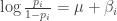
This model provides estimates at the home run probability for all hitters against all pitchers. For example, here’s a graph of the observed (black) and estimated (red) HR rates of Aaron Judge against all pitchers that he faced in the 2017 season. (I’ve jittered the points to avoid the overlapping issue.)
Here is a graph of the home run rates of Cole Hamels against all batters that he faced.

Comparing the two graphs, one can see the higher variability in estimated true rates for the pitcher (Hamels) than for the batter (Judge). That makes sense since we already saw that there is more variation in hitter rates than in pitcher rates.
Takeaways
- This post was motivated by the remarkable ease in getting the data from the Retrosheet play-by-play data and modeling by the
glmerfunction. - Although we record the raw count of home runs for batters, actually teams are more interested in predicting the performance of batters in 2018 — in that case, the estimate at the true home run rate is more relevant.
- This post confirms that home run hitting is more about the hitter than about the pitcher. More of the variation in home run rates is due to hitter differences rather than due to pitcher differences. In other words, Aaron Judge will hit a home run from a badly placed fastball from any pitcher.
- Although there might exist some interesting interactions between specific pitchers and hitters, there is insufficient data from a single season to conclude there are real effects. It might be interesting to look at many seasons with more data — there might be some true batter/pitcher matchup effects in that case.
